Right Now with Nick Smith (Linkedin/Twitter)
What I’m watching: Is It Canceled Yet? (Sorry, OA fans)
What I’m re-reading: Alberto Cairo’s “The Truthful Art: Data, Charts, and Maps for Communication”
What I’m listening to: I have a soft spot for cover songs, and I think at this point we’re all hoping for The Cure, so … here’s The Get Up Kids’ version of “Close To Me”
Good morning! Raise your hand if you were at my #ELGL18 keynote in Golden. Now put your hand down, silly, I can’t see you and you look ridiculous.
If you were, then you’re familiar with the concepts of numeracy and media literacy. This is a great start. But moreover, with this COVID-19 outbreak going on, I hope you see now why I think that misinformation is an existential threat to our society.
You see, reader, there are a lot of data coming out related to this whole thing, and they’re changing rapidly. They’ll be different by the time I finish writing this, and they’ll be even more different when you’re reading it. The issue with this is that even when people are trying to help by visualizing the data, they can really foul things up and muddy the waters.
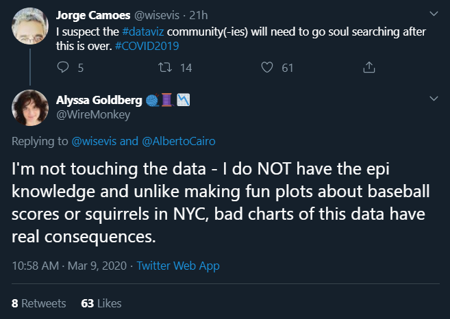
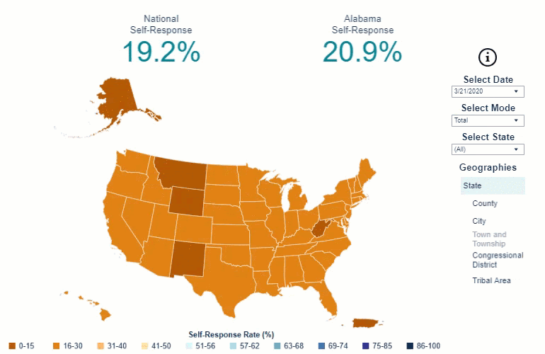
Unfortunately, not everyone shares the sensibilities of our friends in this screenshot here. In fact, many people are racing to take this exciting new dataset, and apply their own perspectives to it.
Take, for instance, this chart. I don’t even want to share it, honestly, because it’s irresponsible and I don’t want it going past this article. It’s part of a larger data visualization from ESRI’s very own Story Maps team called “Mapping the Coronavirus Outbreak”, and I think it makes a striking point. Take a look at it, and tell me, what do you think it means?
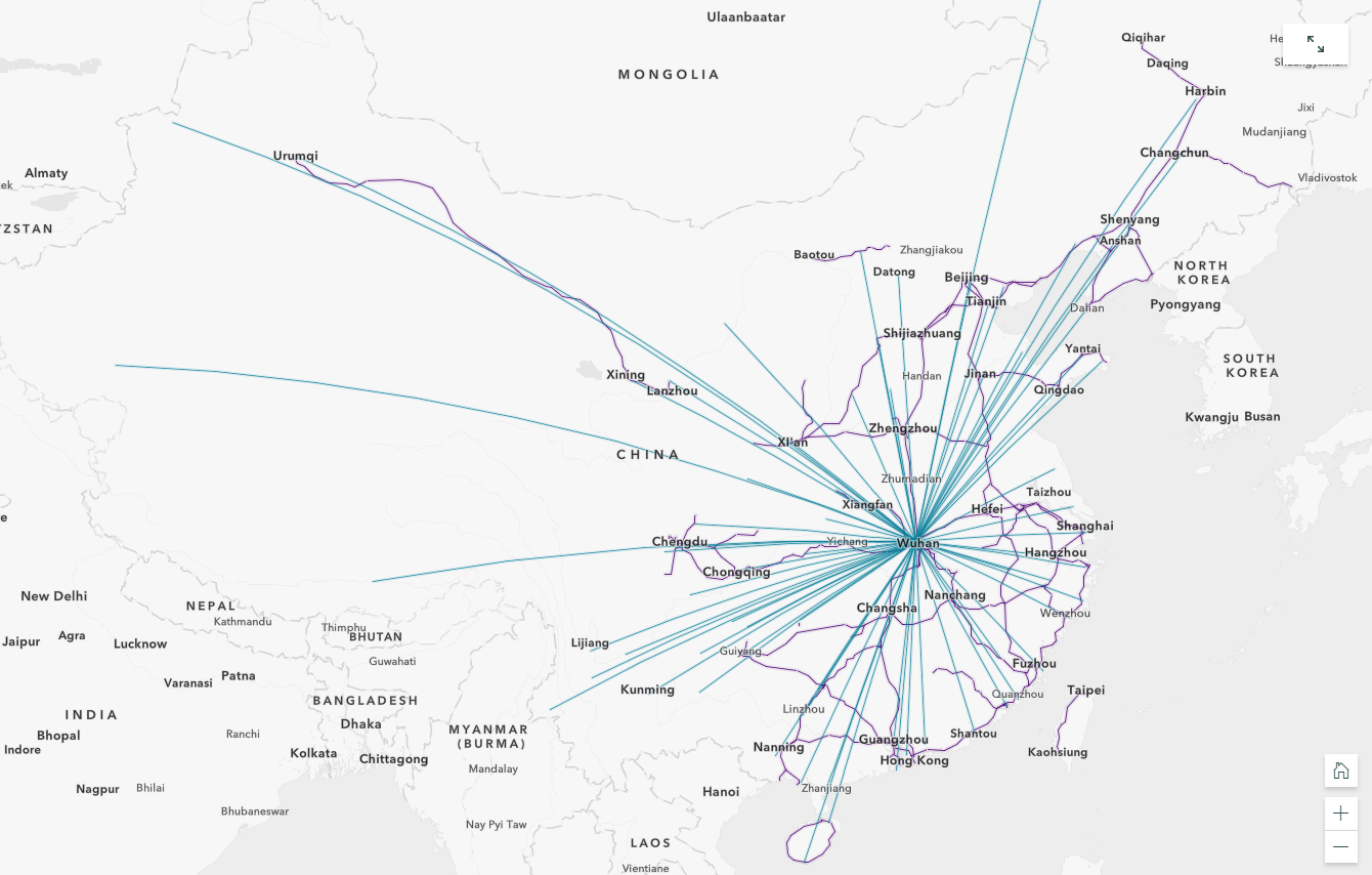
If you said “The blue lines are domestic flights into and out of Wuhan in the year 2018 and the purple lines are railways as taken from a 2016 dataset,” congratulations, you are the only one. But that’s what it is. And why? Who knows. I literally cannot fathom why someone would take a situation that is changing by the minute and try to relate two-year-old data to it.
But this betrays something else — no matter how pretty someone can make a chart, there are so many unknown unknowns with this. The numbers don’t reflect reality, because they can’t. We don’t even know the actual mortality rate of this thing, because A, it’s not over, and B, we don’t even know how many cases there are.
My point here is the same one I made in Golden — that even good, smart, and well-intentioned people can inadvertently use data to make bad points, and there’s a lot of that going around right now.
In local government, I think it’s safe to make a few assumptions:
- Very few of our agencies employ trained epidemiologists
- Very few of our agencies employ trained data scientists
- Even fewer of our agencies employ them in tandem
- None of us have ever been through anything like this
- The last time anything came even close (SARS? maybe?) there wasn’t social media
- Despite all of this, we are still responsible for the physical AND mental well-being of our residents.
So what can we do? There are a few things:
First and foremost, do your best to stay healthy. You should also familiarize yourself with ready.gov‘s section on pandemics, because you can’t help anyone else when you’re a mess.
Next, check out the CDC’s information on the outbreak. Familiarize yourself with their FAQs and things you should know about symptoms, treatment, and prevention, so that when it comes up — whether through earnest questions or misinformation — you can help. This will also help with Step 1.
They even have a section on guidance for public health communicators with “Before, During, and After” sections so that you can fine-tune and target your response as your community moves through each phase of this process.
You should also sign up for ELGL’s sessions on COVID-19 & Local Government Response on March 13: There’s a morning session and an afternoon session. These are going to have all sorts of pertinent, in-depth information that’s too much for me to cover here, as well as perspectives from your local government peers from across the country.
Fourth, arm yourself with the confidence to interpret the things you see. If you’re on Twitter, I highly recommend you follow, among others: Alberto Cairo (who I mentioned at the top there), Catherine D’Ignazio (MIT Urban Science professor and author of Data Feminism, who explores the ethical dilemmas of data science), and Lisa Rost (who’s currently tracking this in a very responsible and easy-to-understand way).
Fifth, if you’re going to share — or really, even just ingest — data, or data visualizations (about this or any other subject), please, make sure they’re responsible and from trustworthy sources. Have questions? Ask! Whether it’s about how to read something, or where the data comes from, or anything else, it’s always better to be sure.
Finally, wash your hands. Whether or not there’s a public health crisis. It’s just the right thing to do.