This is a guest blog post by ELGL member Ed Krafcik with Soofa. In this post, he writes about how Soofa helped measure the crowd attendance during the 2017 Boston Marathon.
 “If we want to make agile cities, we need to know what works and what doesn’t. Data collection allows us to reflect in real-time on how spaces are used and make informed decisions about how to change these spaces to better serve the community. We studied the Boston Marathon to show the power of data collection from a highly recognizable event.”
Katy Gero Lead Data Scientist | SOOFA
Sensor data revealed pedestrian activity peaked between 11am and 4pm in Boston along the race route on Marathon Monday. But that’s only the beginning, see what else we learned.
We studied the Audubon Circle intersection along the Boston Marathon race route, about one and a half miles from the finish line on Boylston Street. Using our Soofa Pro sensor we found that the peak time on Marathon Monday attracted more than 7X the number of people who normally pass through the intersection during the same time window on an average weekday.
The graph below was created by analyzing three weeks of sensor data from a Soofa Pro Sensor on the corner of Beacon Street and Park Drive in Boston, also known as Audubon Circle.
 Through simple, intuitive data visualizations, we are able to see the impact the Boston Marathon had on pedestrian traffic at and near the Audubon Circle intersection by comparing baseline data with event specific data.
Here’s how we did it:
 1. Set up a Soofa Pro Sensor on the south west corner of the Audubon Circle intersection.
2. Captured pedestrian traffic data on Marathon Monday, April 17, and for the three weeks following.
3. Took an average of pedestrian traffic every hour of every weekday for three weeks to build the red line shown on the graph above.
4. Compared this average with the actual traffic on the event day, Marathon Monday, to analyze the impact the race had on pedestrian activity at and near the intersection.
3.6 million rows of data tell us people congregated extremely quickly, stayed for a long time, but didn’t stick around long after the main group of runners passed by.
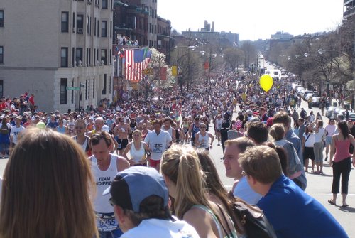
 As the photo shows, the crowd size at and around Audubon Circle was many people deep on both sides of the race route. What we can’t see from this photo is exactly when the crowd grew, how long most people tended to stay, and when the crowd dissipated.
Over a three week period, our sensors gathered more than 3.6 million rows of data, letting us go beyond the basic understanding that the Boston Marathon attracts a lot of people to actually knowing how big the crowd size was at its peak (plus how this relates in relative terms to average traffic flow) and also how the public tends to value different points in the race throughout the day.
In this particular location, the bulk of the crowd was just about as equally excited to see the elite runners pass by as it was for the later waves of runners. This is illustrated by the peak traffic remaining generally consistent between 12:00 p.m. and 4:00 p.m.
The data visualization also shows that in the morning people came to watch in two waves, the first being about 9:30 – 10:00 a.m. and the second starting at about 11:30 a.m. This is evidenced by the two different slopes on the graph in the morning hours.
While we see the crowd build up in multiple phases, the crowd leaves nearly all at once shortly after 4pm when the average fourth wave runner was finishing the race.
At Soofa, our sensor data partners use this type of data and similar analytics to inform planning decisions, programming and event management, capital improvement budgeting, and more. Below are a few examples.
The Boston Marathon is a great example to see the power of capturing pedestrian count numbers and quantifying baseline public space activity levels because it is such a recognizable event.
Read more from Soofa online here.