Mariela Alfonzo has over 15 years of expertise in the field of urban design and behavior research. In 2014, Mariela was recognized as one of Urban Land Institute’s 40 under 40 best young land use professionals around the globe. In 2013, Dr. Alfonzo was awarded a Fulbright to examine walkability in China. Here’s Mariela’s article from last month – Does Walk Score Walk the Walk? Catch Mariela’s presentation at #ELGL17.
By Mariela Alfonzo (LinkedIn), State of Place
Have you ever been to Tigard, OR?
I’m guessing your answer is no…But…YOU’RE WRONG! Well, you’re actually kinda sorta metaphorically wrong. You see, if you’ve ever been to a post-WWII, auto-dominated U.S. suburb, you’ve basically “been” to Tigard…
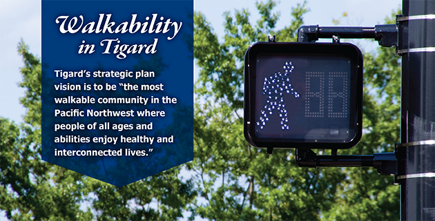
In 2012, the City of Tigard took the first small step any city needs to take to get on the walkability wagon…it admitted it had a problem. But crucially, it then took a giant leap toward establishing a truly livable, sustainable place for its citizens – it proclaimed that it aimed to become the most walkable city in the Pacific Northwest! Ambitious? Maybe. Bold? Definitely!
Below we present the story of Tigard to show how we help cities use data and analytics to more effectively actualize their visions and justify the need to do so, and by proxy, help cities attract more residents, retailers, employers, and quality developers and, increase their economic and environmental resiliency. In other words, we are not in the business of producing dust-collecting reports. We are in the business of equipping cities with the tools they need to use their (limited) time and money more effectively to help create places people love (as we wrote about in last week’s blog where we outlined how we’re helping cities reach their New Year’s Resolutions to put ON the (placemaking) pounds).
Tigard Is All of Us
Or technically over 70% of us, according to Walk Score. While I’ve never been to Tigard in person, I feel a personal connection because of my own experiences growing up in my hometown, Miami. And I’d bet that any of you who have spent time in a typical U.S. suburb would feel that sense of deja-vu if you did ever go to Tigard…
Where is Tigard? All over the U.S.!
Strip-mall lined 6-lane+ arterials
Power centers surrounded by a sea of asphalt
Pedestrian no-man lands
Cookie-cutter single-family home subdivisions
Sound familiar?
Based on conversations that we’ve had with U.S. cities and developers so far, your answer is a resounding, YES! You are trying to do something about it, struggling with what to prioritize and how to allocate your limited resources, and battling the many folks not quite yet ready to join you in the “wagon.”
So you’ve “been” to Tigard. And damned if you do know their struggle all too well… The real question is, what are you doing about it? Here’s how we help the “Tigards” of this world.
Ready, Set, Vision! Umm…Wait, Now What?
The City of Tigard identifies its problem, establishes an awesome vision, and then…? Well, Tigard first went the typical route. Planning studies. Expert Consultants. Community Outreach. All worthwhile endeavors. And then they met us (actually, Kenny Asher, the city’s Community Development Director, came across my ULI post on the economic rationale for walkability).
Our urban data geek hearts danced with joy when we heard they wanted to use data and analytics to help realize their vision. We couldn’t wait – not only to help them craft an evidence-based, data-driven strategic framework by which to systematically achieve their long-range planning goals, but also to arm them with the justification they would need along the way, to convince residents, developers, and commercial property owners – it was about enhancing the public good, but also about making the public purse more efficient and resilient in the face of changing demographics and preferences.
The Tigard Triangle is located in the NW part of the city that primarily contained large-scale commercial uses and was one of the least pedestrian-friendly areas in the City. We worked with students at Portland State University as part of a service learning agreement. We also worked with Tigard for nearly four months, applying the State of Place suite of analyses.
Dig into this great user-story – I promise you’ll see a bit of yourself in the protagonist!

- Conduct objective, robust assessment of existing walkability of the Tigard Triangle.
- Prioritize and recommend urban design improvements most likely to boost walkability and economic development.
- Quantify the impact of various development and planning proposals with respect to walkability.
- Forecast the economic premiums, value capture, and ROI of several proposed scenarios.
GIVE ME MY DATA!
We hear a LOT from cities and developers about the lack of quality data. Data that tells them what they don’t know. Data that captures why people love their city – or don’t. Data that guides them. Data that helps them tell a story. Here’s the “skinny” on our not-so-skinny data.
 We usually collect our customers’ data first-hand, when they initially become part of the State of Place “family.” Data is collected by “certified” raters who have undergone a robust training protocol using a super nifty app. Sometimes our customers get in on the data-collection action, although we usually do this in-house. Data can be collected on-site or using Google Streetview. Data is collected at the block level, defined as the area between two intersections. Data can be collected for an entire project area (at any level of geography) or for a sample of blocks.
We collect data on over 290 built environment features – like street trees, sidewalks, benches, curb cuts, etc. – related to walkability at the street level. Here’s a handy guide with all of the features we collect, grouped into various urban design categories.
As part of the service-learning project we set up with the City of Tigard, four PSU students completed the State of Place certification process, including a 2-hour in-class training video, a 1-hour virtual training/quiz session, and a 1-hour debriefing session to ensure the integrity, accuracy, and reliability of the data. PSU students collected data for all blocks within the Tigard Triangle – over 70 of them! Way to go, Curtis, Linn, Ray, & Wala!
HOW BAD IS IT, DOC?
We have a ton of data. Now what? We hear from folks who have managed to amass a ton of their own data. Some of you have even used our old-school paper version of our data collection tool to do so. But then, the story often goes, what do we do with it? How do we pull this all together in a way that is not only statistically sound but also not just a series of numbers? Data for data’s sake is (mostly) useless (unless you’re a super-duper data geek!). For us, data is about telling stories…and not just any stories, stories that ease your PAIN and make it easier for you to create more walkable, high-quality places.
For Tigard, data was about knowing where they were starting from – what they were dealing with. How big of a challenge did they actually take on? How much more TLC does the Tigard Triangle need than their Downtown? How do they compare to other places struggling with the same issues. How far off are they really from where they aspire to be?
The State of Place Index tells cities struggling to increase place quality what they need to hear – how bad is it?; and it tells cities who have made strides toward walkability what they want (and deserve) to hear. Our proprietary algorithm aggregates the 290 data points into a place quality index, ranging from 0-100 that indicates how walkable – convenient, safe, comfortable, and pleasurable – a block, group of blocks, or neighborhood is. Cities can compare themselves to other cities in our database, which contains neighborhoods along a full continuum of walkability, from rural, exurban, suburban, and urban. As the highest score is determined by the highest observed score in our database, cities can use the State of Place Index as a benchmark. They can also compare themselves relative to their own highest scoring block, which helps gain a more nuanced understanding of their walkability and quality of place.
The State of Place Profile then gives cities the low-down: What am I doing wrong? How can I improve? That is, the Index is broken down into ten urban design dimensions empirically known to impact people’s decisions to walk, perceptions, location decisions, consumption patterns, etc. In other words, the State of Place Profile serves as a walkability and place quality diagnostic tool, highlighting an area’s built environment “assets and needs,” or why a community is or is not walkable. It’s not enough to know your Index – you have to know how to make it better…especially since two blocks or neighborhoods with the exact same Index can have vastly different profiles.

The Tigard Triangle scored a 33 out of 100 on the State of Place Index – while it was a bit of a harsh dose of reality, the City saw tremendous value in benchmarking where they were truly coming from and understanding what facets of urban design needed to be prioritized. We ran the State of Place Index and Profile for every block in the Triangle, which also helped identify specific geographic areas in which they should intervene, as well as the Downtown, so they had a local basis of comparison.
The Profile tells you what you need to improve. The Index helps you identify where – geographically – would make the most sense, strategically, to focus on. But for most “Tigards,” that’s a lot of TLC you’ll need to dish out! Should you prioritize the urban design dimensions that scored the lowest? Those that your community has been asking for for a while? Those with the biggest economic development potential? It’s up to the city!
Our forecasting model predicts the relationship between State of Place and a variety of outcomes, like pedestrian volumes and retail revenues. We estimate how much say a 10-point increase in State of Place would impact office rents. The ten urban design dimensions – they matter differently based on how you are measuring success. Cities enter their goals on our platform and get evidence-based urban design priorities!
Adjust Feasibility of Making Changes
Some of the ten dimensions are harder to “fix” than others – like once the street layout is in place, connectivity is pretty hard to change, but aesthetics and personal safety are much easier, as you can slap a coat of paint on a building or repair some broken windows and it can make a world of difference. Cities can also adjust the “feasibility” of making certain changes based on their own circumstances. Finally, cities can even take into account citizens’ preferences and satisfaction levels.
Tigard’s goal was to increase walkability in the Triangle area. Urban design dimensions would most boost pedestrian volumes took priority over others. We ran an in-depth analysis for Tigard, looking at the urban design features they needed to address – and on which blocks – to most effectively increase walkability. We pinpointed the built environment attributes that they needed to increase or decrease in order to increase the State of Place Index and Profile.

From City of Tigard Prioritization Report

Specific recommendations for one block within the Tigard Triangle.
DECISIONS, DECISIONS!
Now you have your priorities straight! How does that get translated into a plan? How do you know the actual impact of a planning proposal? How do you know it’s achieving your aims? How do you evaluate all of those proposals that are coming in response to your RFP?
Cities and developers can pull the State of Place data for an existing block and make changes to the existing conditions based on the proposed plan you are evaluating. Or you can simply play with the data and make changes.
In Tigard, we modeled different development projects.
Proposed Development Project #1: Medical Center
Medical center, 35,000 sq.ft. and cost of $6,4M.

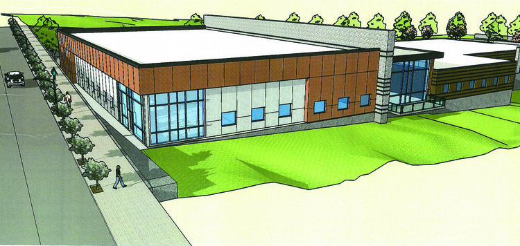
Proposed Development Project #2: Mixed-used Building
 A medical center along with a mixed-use residential and commercial building. The building is a three-story structure, with approximately 2,600 SF of ground-floor commercial followed by two stories of residential units totaling approximately 8,300 SF and eight units. The site layout includes 14 standard, 10 compact, and 1 ADA-compliant parking space, as well as a 24-foot drive aisle and 30-foot driveway skirt with direct access to SW Gonzaga St. Landscaping is proposed along the property boundary, as well as additional street tree treatment to the building portion that fronts SW Gonzaga St.
The second mixed-use scenario had a significantly higher impact on the State of Place Index and Profile! While cities know this intuitively, there’s something that’s powerful about bringing data to the table, and highly visualized data at that.

SHOW ME THE MONEY – OR AT LEAST THE WHY.
You’ve got your diagnosis (Index & Profile). You’ve got your prescription (Priorities). You have a prognosis (Scenario Analysis)! Now what? I know, I know, you have to deal with…the NIMBYS!! They are everywhere. It’s not just residents. Naysayers come in various shapes and sizes! Traffic engineers. City managers. The County! Electeds. Property Owners. Developers. Everyone has their own interests. Their own agendas. So how do you convince them – without entering the never-ending meeting twilight zone?! While the scenario analysis feature sets you nicely, we’ve learned that in addition to data, money also talks – or at least helps explain why it makes sense to invest in better places. It actually helps to identify projects that indeed will be more cost-effective.
Tigard supplied information about their real estate market baselines – office rents, retail rents and revenues, residential rents and for-sale values, their estimated project costs, and the square footages for each of the new land uses being created for both scenarios. Based on the forecasting model, we estimated the real estate premiums tied to the increase in the State of Place Index in the single use vs. mixed-use scenario; the value captured from those premiums+baselines over time (10 yrs) based on the total square footage of the new buildings that would be developed (i.e., (premium + baseline) x project area x 10); and the return on investment (ROI) based on the project cost (i.e., value captured/project cost). You can clearly see the upside – both from a livability/walkability perspective and from an economic perspective of the mixed-use scenario. This is the kind of analysis that will indeed help Tigard move further toward its vision to become the most walkable city in the Pacific Northwest!
Tigard Forecast Analysis

Supplemental Reading