Last week we explored some overarching trends in the data. Since then, we welcomed 60 more municipalities into the Diversity Dashboard family!
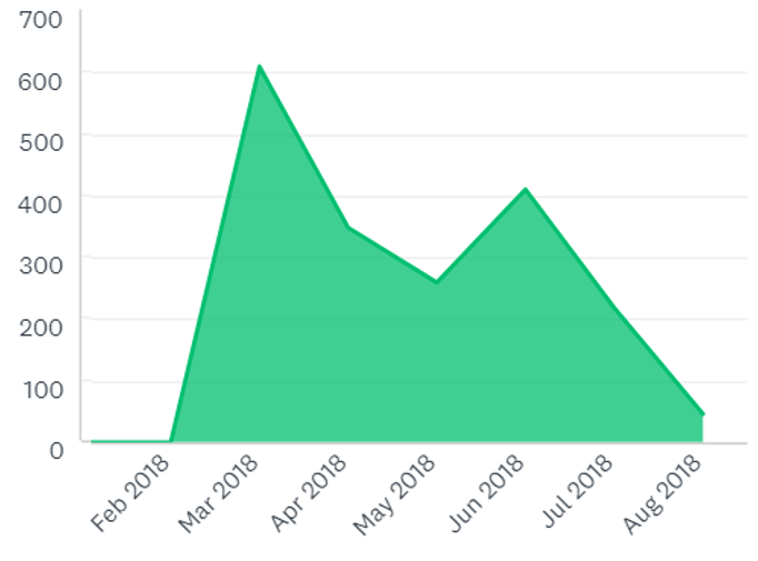
The end of August marks six months of data gathering. The ELGL team is exploring ways to garner more attention for the dashboard and combat the response lull phase that is all too familiar to data gatherers. As we can see in the Survey Response Rates graph, the follow up requests sent to municipalities as a friendly reminder to complete surveys is providing fewer conversion rates.
Conversion Rate = Completion Rate
Conversion rates are what data nerds calculate as the number of successful responses received from a specific “call to action” or CTA. In this context, our CTA has been the initial emails and follow up emails sent to municipalities asking for their participation in the Diversity Dashboard. CTAs may also include website and blog content linking readers to the survey. Those who click the CTA links and fill out the survey are the “converted” thus directly impacting the conversion rates.
Survey Response Rates

During a call with ELGL data coordinators, we explored ways for increasing the survey response rate with potential incentives and outreach materials. We’d love to hear your thoughts and ideas too! Would you be interested in a downloadable email template to send to your county or local municipal clerk to request survey completion on your behalf? Applying friendly pressure to our local leaders to increase transparency and accountability is what being a dynamic and involved citizen is all about! We welcome any creative ideas to get the word out and further motivate municipal involvement.
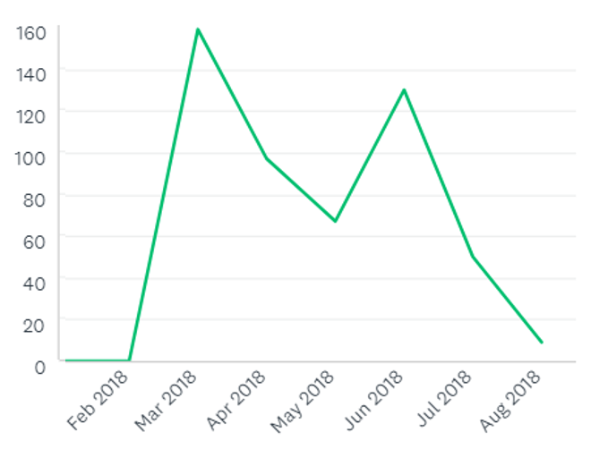
Speaking of completion rates… we are working on changes to the survey template to encourage respondents to answer more questions to provide a more accurate portrayal of demographics. In the graph below, the rate of incomplete surveys hangs at roughly 25% of all our responses.
Partial/Incomplete Survey Rates
It is normal to receive high rates of incompletes, especially with an initial survey template. Extrapolating the data thus far, we are currently brainstorming ideas for fine-tuning our methodology. Here are some potential changes we are chewin’ on at the moment:
-
Provide full survey questions on one page. This helps the respondent see in a glance the # of questions and the type of questions being asked, rather then navigating through multiple pages with no end in sight.
-
Require certain questions to be answered with the questions of highest priority at the beginning and * to convey a required response.
-
Include “currently vacant” as an initial answer to the question sets for CAO and ACAO questions. This allows many of the current no-response entries left blank or filled in as “not listed” or “N/A” to be clarified with a vacancy option, further clarifying and cleaning up the data.
-
Include fill in the blank option on with a positive vacancy response for “date of upcoming incumbent” or of “upcoming election”. This allows Dashboard readers to note a current vacancy and can even help facilitate any constituents interested in running for that position.
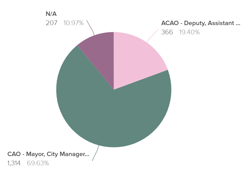
The question regarding the surveyor’s level of admin serves as a great example of a large “N/A” response rate that may be restated in the survey template to decrease the number of “N/A” responses in the future.


The majority of who have not checked either box (thus creating the”N/A” response) are continuing on to the next questions regarding the CAO and ACAO details and leaving those questions blank as well. Adding another option such as “Other leadership role – ______” and “Other non-leadership role – ______” might give the respondent more clarity for the need to add the demographics of the administrative leaders even if the respondents themselves are not in CAO/ACAO roles.
So as you can see, there are so many interesting plots in our data narrative…and we are just getting started!

