Welcome back to Data Stories! This week is part two of Regionalism and we are diving into some pretty interesting diversity stats from around the country.
Regionalism Part 1 explored how we define regionalism and why it is important to have clear and shared metrics with data collaborators as well as with you, the reader. If the regional delineations are not consistent with the attributes explored, we will be sacrificing validity and clarity, which is obviously the opposite of this blog’s intentions.
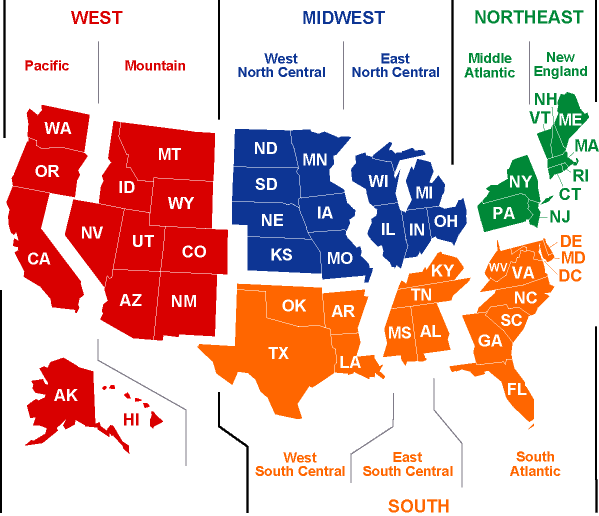
Using the US Census as the regional control map, we can overlay the regions and districts onto other demographic maps to create some useful visual narratives.
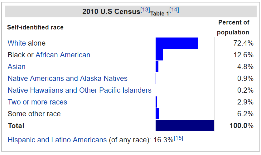
As we receive respondent data regarding ethnic and racial make-up of local government leaders, we can compare leadership representation to the constituent population.
This nation-wide map of counties shows where races are represented higher than the national average as reported on the 2010 US Census.
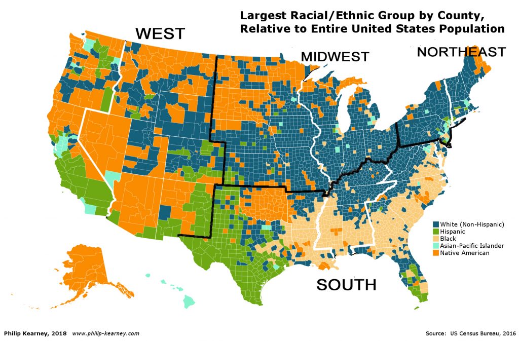
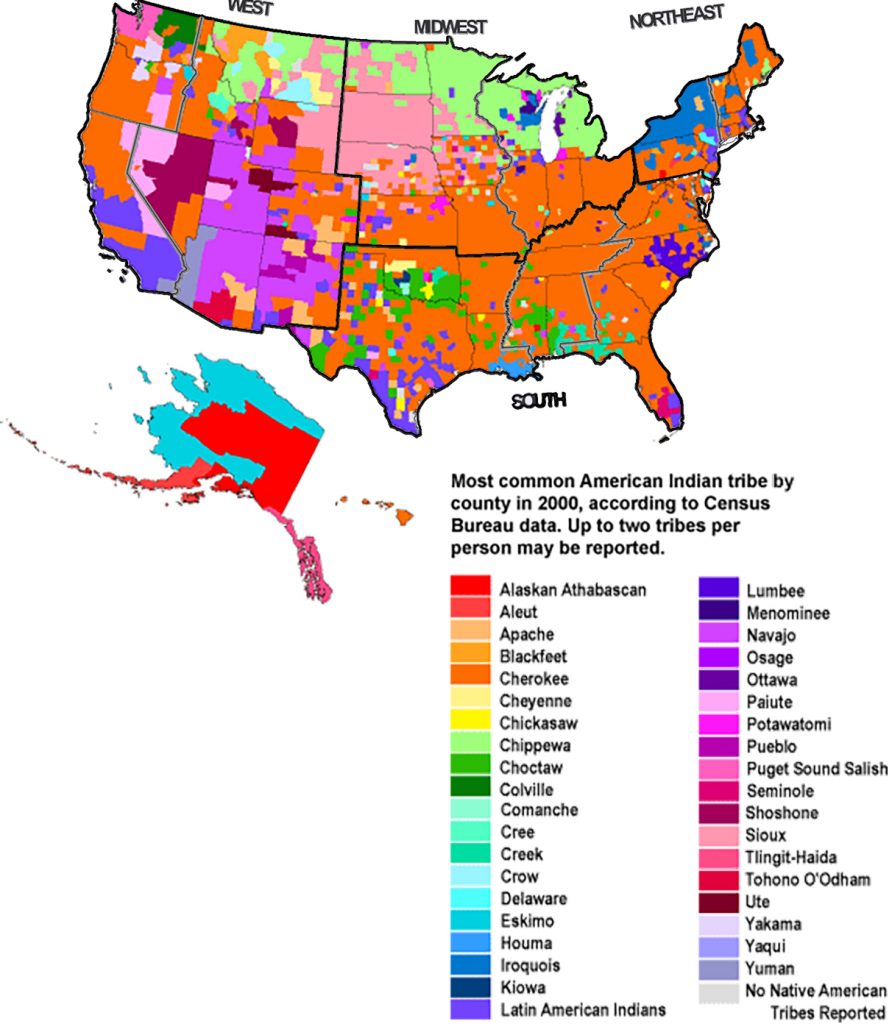
The regional differences are quite stark. Large concentrations of non-Hispanic whites are found in the northeast. The midwest too, plus larger Native American populations. The south is dense in diversity, with Hispanic concentrations in Texas, black populations in the southeast, with large multi-ethnic numbers in the southern tip of Florida. The map also portrays the multi-cultural history found in the Pacific West. Overall, this is a great map to support the narrative that greater diversity is found in the South and the West. Is there anything that surprised you about this map’s findings?
Check out these great regional maps that show each ethnicity group’s distribution and population density.
Population Density: Black (Non-Hispanic)
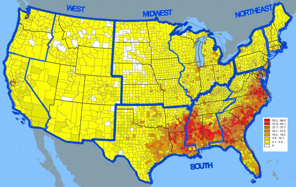
http://www.censusscope.org/us/map_nhblack.html
Population Density: Hispanic/Latino
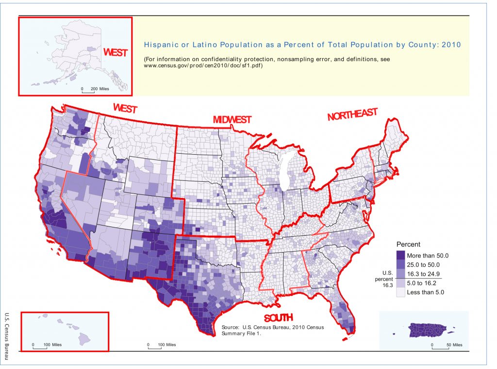
https://www.census.gov/geo/maps-data/maps/datamapper.html
Population Density: Asian
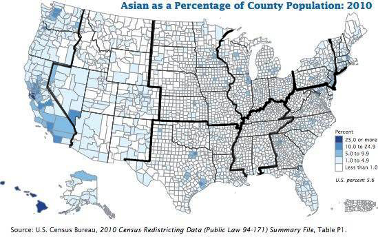
Population Density: Pacific Islander
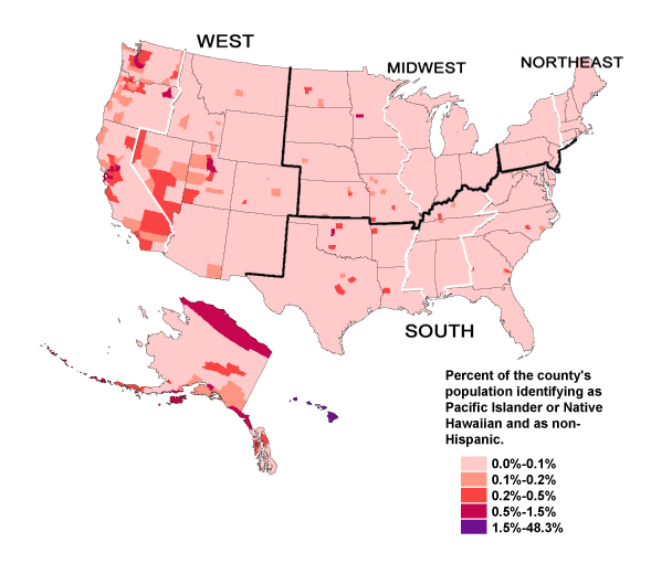
https://www.census.gov/geo/maps-data/maps/datamapper.html
Native American Tribes: Major Populations
https://www.census.gov/geo/maps-data/maps/datamapper.html
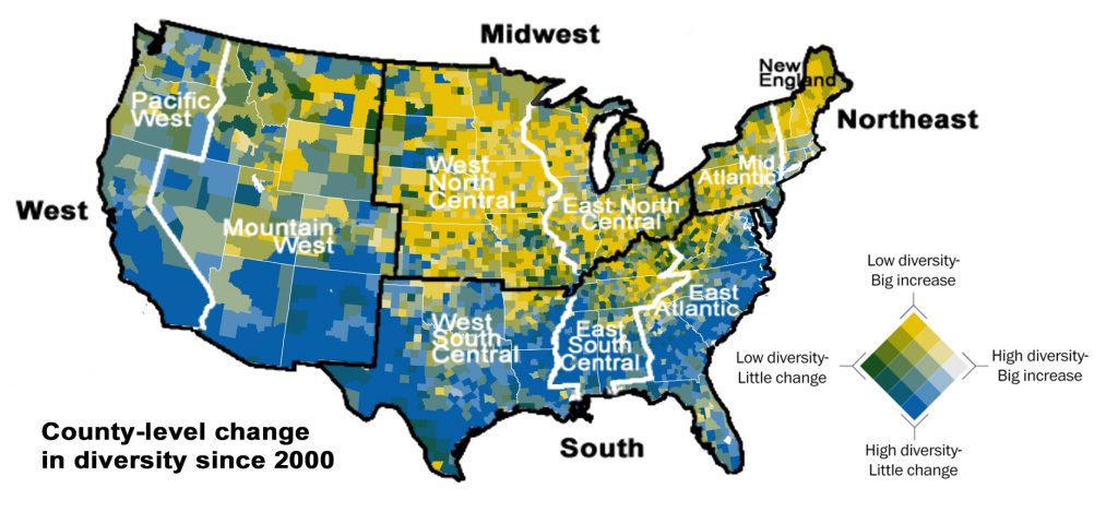
The country’s racial and ethnic makeup is constantly evolving. This next map provides an interesting view of national shifts in diversity. Note how the Midwest is losing diversity whereas the Pacific Northwest is seeing big increases in diversity since 2000.
Growth in Diversity since 2000
https://www.washingtonpost.com/graphics/national/how-diverse-is-america/
Should we be paying more attention to “Mega-Regions”?
Population Centers: Regional vs Mega-regional
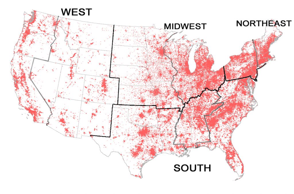
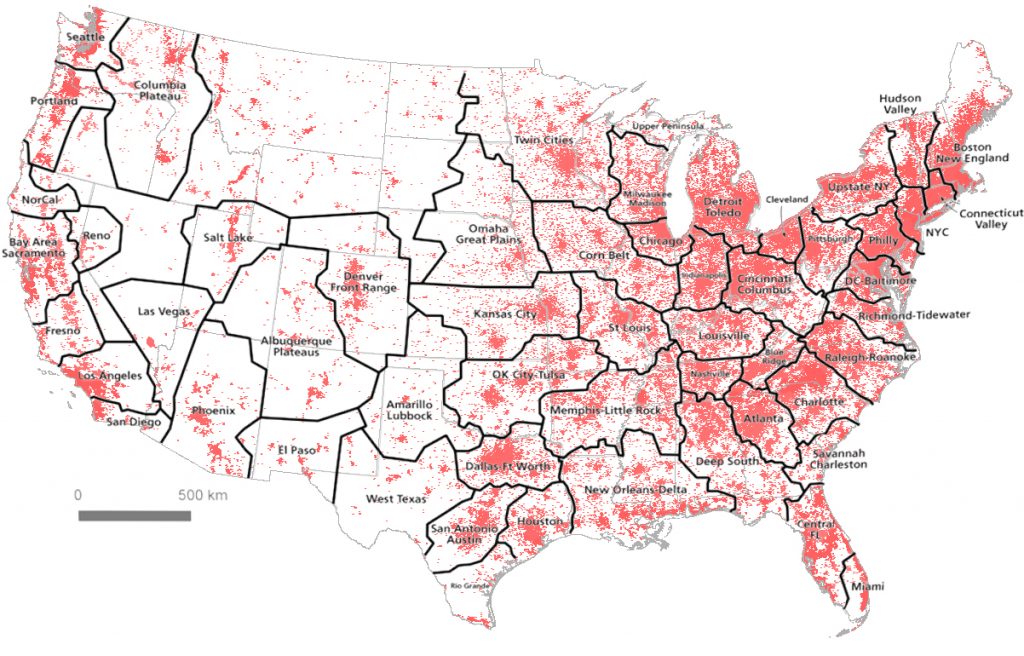
Check out the population distribution through mega-region’s delineations. What if our state boundaries looked like this? What if we had regional congressional representation based on population centers? How would our electoral college look compared to representatives in traditional state lines? The use of traditional regional lines have obvious merit; geographic and climate differences are notably different among the four regions. For example, coastal districts of the Pacific West and South Atlantic are useful groupings for economic assessments regarding global trade, the Mid Atlantic and New England, too. But what about the Gulf Coast region? The Mississippi delta? The mega-regions might give us a more neutral approach to data narratives if assessing the “New Orleans Delta” with impacts based on this agriculture epicenter instead of seeing the same region as part of three different states.
https://www.census.gov/geo/maps-data/maps/datamapper.html
Here’s an even more dramatic version of population distribution as seen in the way we have congregated densities into metropolitan areas.
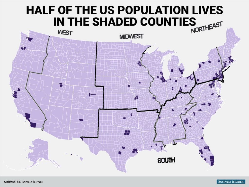
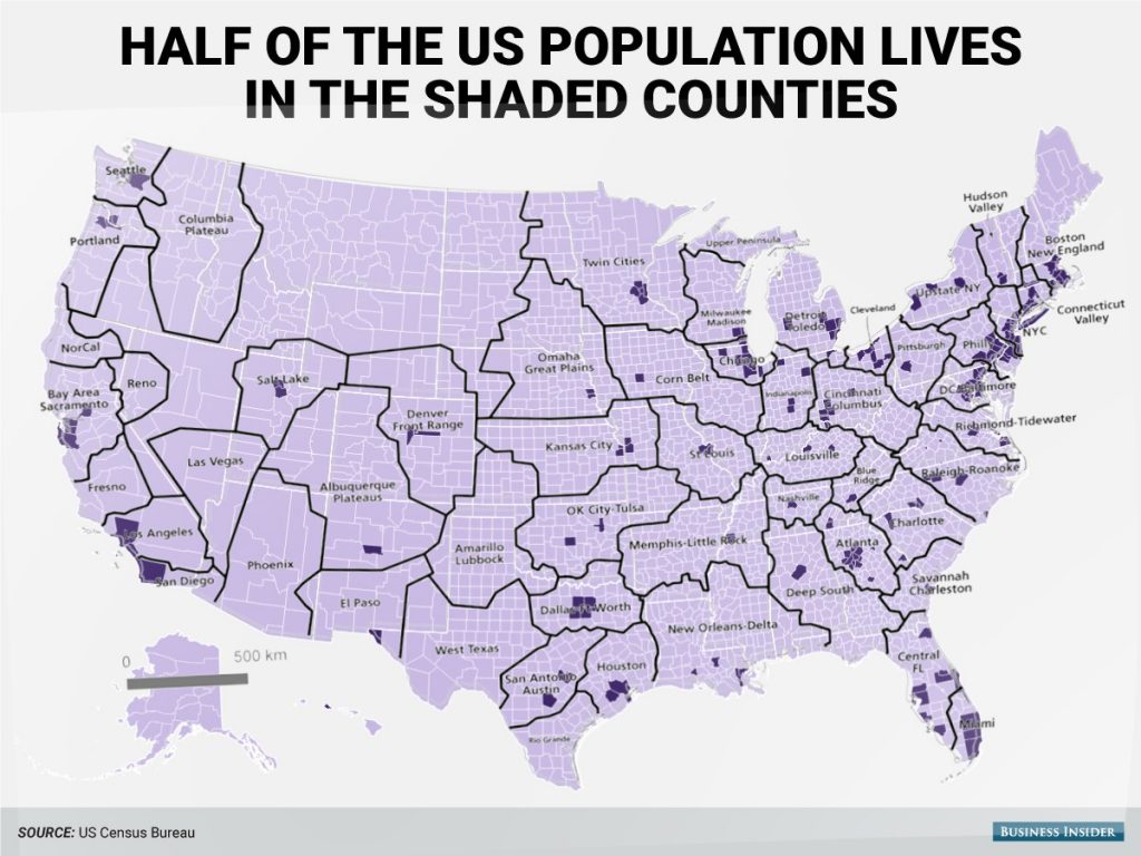
As we are working to promote diverse representation in our local governments, its important to see where those big pockets are diversity are found. Mega-regions hold a lot of information in their density levels as well as their own squiggly boundaries. More on that here. Diversity by definition represents a variety of cultural and social elements displayed in ways that increase awareness and representation of those population groups that often have oppressive roots in this country. Looking through the data with a regional lens we can see where cultural histories of certain people groups have been both restricted and where diverse communities have flourished.
As we paint our country’s portrait of place and identity through data, we begin to see the vast cultural layers that have influenced and evolved the nation’s heterogeneous nature. Who doesn’t love a good melting pot?
Join me next time for more stories between the data lines!
