In the world of government, we tend to be wordy little beasts trying to explain the nuances of public issues in paragraph upon paragraph of words within reams of paper. We’ve killed thousands upon thousands of trees in the name of public information.
But what if it didn’t have to be that way? What if, in some cases, we could ensure the community had easy-to-understand information at their fingertips in a simple and succinct way?
That’s where infographics come in – a communications medium employed by the private sector for many years and often utilized by larger governmental entities with the graphic design resources to create effective educational images for the public. Infographics can be created without design experience for those local governments working off of shoe-string budgets, though.
First, we’ll explain why infographics are important and how they can be built to be effective. Then we’ll discuss some options for those local governments who don’t necessarily have the resources to hire a true graphic design professional for this work. It’s always nice to be able to show your community that you are working to communicate in a diverse set of ways for little to no increased costs.
Infographics are increasingly important for communicating complex information to an on-the-go audience equipped with the latest mobile devices. Smartphones and tablets aren’t much good at crunching numbers (when was the last time you used the calculator app to do anything beyond figuring out the tip?), but they’re ideal for displaying charts, graphs and data illustrations.
Here’s an example from the Village of Oak Park in suburban Chicago. This was created by a contract graphic designer who has worked on all sorts of print and web projects for the village. A version of this infographic is produced each year as part of the budget roll-out, and each year it never fails to amaze and astound residents who were seeking a simple, no-frills breakdown of their tax dollar.

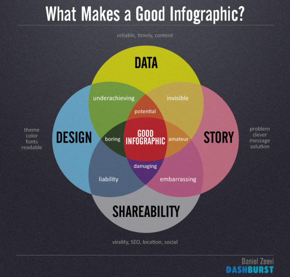
Our challenge in local government is to make those infographics as attractive, informative and shareable as possible, so they reach a wide audience via social media. As with most newsy items coming out of local government, the majority of topics don’t warrant a flashy infographic. Save your efforts for the biggest, most impactful items: annual budget breakdowns, big public safety reports, groundbreaking (literally?) capital improvement projects, and similar data sets that appeal to the broadest possible spectrum of our community.
When building your infographic, keep it simple. Use a color palette inspired by your municipal logo (if applicable). For complex data sets, don’t worry about listing every possible category – just highlight the important stats, then lump everything else into the “other” category. Contrary to popular belief, infographics aren’t meant to be exhaustive. (That’s what Excel spreadsheets are for!) Rather, they’re communications tools designed to help us pass along complex information at a glance.
Here’s another from Oak Park: a quick look at 2014 business investments, created by a graphic designer on retainer with the organization.

So what are your options for building these? There are, of course, the options to take classes to learn how to design graphics. You could hire a professional who really knows what they’re doing out the gate. There are, also, numerous websites that both provide tips on creating graphics and others that will help you generate them on the fly. Here is our (in no way at all) exhaustive list of some of those websites:
Here’s a video on five keys to a great infographic:
Patrick Rollens works for the City of Corvallis, OR. Sam Taylor is a local government professional who has worked in California, Idaho, and Washington
