This guest blog is by Jeremy Shackett, Engagement Strategist at Bang the Table.
Do you ever find yourself at the bottom of a rabbit hole of TikToks or YouTube videos? Do you ever go to Amazon looking for one book, and realize you have two books, a stapler, an air fryer, and a set of dog toys in your cart?
This is by design. Tech companies invest huge sums of money into making their platforms addictive. Online businesses spend extravagantly on tools that make more people buy their product. These huge companies increase engagement in a few costly ways. They hire the best web and graphic designers to make their platforms beautiful. They pay people to play around with their apps and discuss them in focus groups. They do rigorous user testing, seeing if a larger font or different design will make 1% more people buy their product or scroll 1% longer.
In local government, you are competing against these exact platforms when trying to get more residents to engage with you. This puts you at a disadvantage because you don’t have the same resources to splurge when you launch your online community engagement project. The good news? It’s possible to learn the same universal principles the tech behemoths use and apply them to whatever platform you use for community engagement – at no cost.
Here, I will share one basic principle, one technique, one tweak, that, if applied to your community engagement work, can boost participation overnight.
I will go into further detail in this month’s webinar. If you want to learn more, you should sign up here.
One principle: Don’t make me think
If you structure your information in a confusing way, your residents will leave. Not because they’re dumb, but because they would rather spend their time somewhere else. The book “Don’t Make Me Think” expands on this idea, with a pretty self-explanatory book title.

The picture above shows two variations of the same menu. Same information, same level of detail, same prices.
If you walked up to a restaurant with the menu on the right displayed, would you eat there?
No? Why not?
You know how to read. None of those words are too difficult. What’s the big deal?
The menu on the right doesn’t sync up with how the human brain processes information. We constantly seek out patterns in the world around us, cluster them, and organize them. If you’re looking for shareables, your brain knows to look for bolded text with some words like “Appetizers/Shareables/Starters” and then review the options in that box. That takes so much less energy than reading the entire menu.
Heuristics are mental shortcuts that we take to solve problems more efficiently. By employing basic rules of thumb, we can make decisions without having to stop and analyze everything. Everyone from web designers (the three horizontal lines is the menu button) to grocery stores (the fresh food is on the perimeter of the store) to Amazon (if it has a 4.5 star rating or above it must be good quality) takes advantage of our brain’s need to find shortcuts.
Applied to community engagement:
- If you are engaging populations with low tech proficiency, don’t rely on virtual meetings. They have the highest learning curve of all online engagement methods. Your residents will choose something easier.
- Structure and arrange your information in a visually coherent way.
- Ask yourself: Will this make sense to someone in seven seconds or less?
One technique: Present one logical next step at a time.
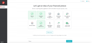
The best user experience in the entire internet comes from your least favorite activity: filing your taxes. TurboTax has invested tons of money into making your tax filing process easy and understandable.
When you file your taxes on TurboTax, you are presented with one step at a time. Press one button, or type in the answer to one field, then hit continue.

Here’s the fascinating part: Unless your tax situation is complicated, the dozens of screens you click through on TurboTax might add up to more clicks and keystrokes than filling out the original IRS form online! But because TurboTax asks you one question at a time, often with user-friendly inputs like emoji buttons, you feel like you’re in the drivers’ seat, making measurable progress toward a goal. This is much less mentally taxing than filling out a smaller, but more confusing, form.
For community engagement, the application is easy: Whatever your call-to-action is, make it clear. Don’t bury it at the bottom of your email or the last paragraph of your press release. When someone lands on your community engagement project, your email, or your social media post, they should know what to do. When they finish contributing, have a system or process already in place that can close the loop and follow up with residents afterward.
One tweak: Simplify your language.
Most people have heard advice like this before, but don’t know the stakes.
I recently ran a quick experiment on readability. I found blocks of text from two of our clients’ sites: one high-performing, one low-performing. I copied and pasted them into Readable.com – a tool that scans your writing for readability. Here are the results, side by side.

Can you tell which is which?
I won’t tell you who the underperforming client is. I can tell you that their content broke Readable. A grade level of 16.9 means you need a college diploma to understand their project information. A reach of 33% means that it is unreadable for 67% of residents.
I can also tell you that they galloped into community engagement with three of the Four Horsemen of the Planning Jargonpocalypse:

I’m not the first person to advise you not to use jargon. It’s honestly kind of a cliche these days. But the most common mistake I see is when subject matter experts (planners, engineers, analysts) hear “don’t use jargon” and interpret that as “use jargon and then use up a whole paragraph to define and explain it in an attempt to clarify the jargon.”
Good writing, in the lens of community engagement, is less about spelling or grammar. It’s all about readability. The underperforming client’s site checked all of the traditional boxes. Perfect grammar. Zero spelling errors. Explained all of the acronyms. Regurgitated the scope of work of the project in excruciatingly accurate detail. Check, check, check, and check.
You need to remember that you’re talking with humans. The golden rule applies here: write for others the way you would like to read. You probably don’t enjoy reading through long, technical and formal writing. Neither do your residents.
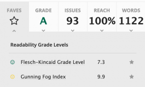
Don’t think this is possible? This article is about how to leverage the fundamentals of user experience design for online community engagement processes in local government (phew!) and here are my stats:

Notice you got all the way to the bottom of this article. Coincidence?
Small tweaks to apply to your community engagement project to increase your reach:
- Shorten your sentences.
- Humanize your language. Write like you talk.
- Cut, cut, cut. Pretend each word costs you money.
- Shoot for an eighth grade reading level. Use Readable.com to check your work.
Putting it all together
Did you like this article? Later this month, I am hosting a webinar that pulls the curtain back even further.
Learn the principles of psychology, persuasion, and user experience design to engage more residents. See the tactics the most advanced tech companies use to increase participation on their own platforms. Then, learn how to apply these to your community engagement project for a fraction of the cost.
