Today’s Morning Buzz is brought to you by Joey Carley, Engineering Technician for the City of Raytown, MO. Connect with Joey on LinkedIn.
- What I’m reading: “Brief: Make a Bigger Impact by Saying Less” by Joseph McCormack
- What I’m watching: “30 Rock” (for probably the 20th time)
- What I’m listening to: “The Rise and Fall of a Midwest Princess” by Chappell Roan
In the midst of the early stages of the pandemic, some people learned to crochet. Others mastered baking bread or establishing a love of caring for plants — my new fixation was learning about flags. Vexillology, or the study of flags, was something that had always intrigued me, but a few years back I dove right into that world.
Recently, a trend has been for states or cities to redesign their flag to embrace a new identity or mark a new era for their communities. This movement perfectly aligned with my foray into public service that began in early 2020. After learning about how other municipalities explored redesigning their flags, I was inspired. My community’s flag was far from the worst I’ve seen, but I thought it could use some modernization and some added symbolism to enhance our civic pride. In fall of 2022 I put my money where my mouth was and mocked up a redesign, shared it with our mayor, and so began a year and half process of seeing my vision become a victory.
The North American Vexillological Association, or NAVA, produces a pamphlet of basic information on flags and design guidelines titled “Good Flag, Bad Flag.” I used that as a basis on how to approach the design, which elements to keep, and which to change. My perspective was that the lettering on the existing flag looked clunky, the colors could be more vibrant, and I could add some design components that would enrich its imagery.
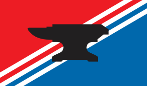
The existing flag’s top half was red, bottom half was blue with “RAYTOWN, MO” printed across the top, with a white anvil in the center. The significance of the anvil is a reference to William Ray, a blacksmith, who was one of the first settlers in the area. Ray’s last name is the namesake of our town, and the anvil remains a symbol of the community to this day.
When I redesigned the flag, I rotated the fields of red and blue to where they’re now diagonal, and the hues more vivid. Overlain parallel to the triangular colored fields are three white stripes, which represent the three historic trails (the California, Santa Fe, and Oregon) that bisected our city. Their diagonal orientation is approximately their real-life orientation across a map of Raytown. The final element of the redesign was to keep the anvil, make it black to contrast the other colors, but remove the text above it. Once I felt confident in my creation, I sent it to our mayor, and he fortunately he was an avid supporter from day one.
Obviously in local government a flag redesign isn’t a priority when there are real, immediate issues to resolve. However, every month or so, the mayor would mention it and loop me in on when it might go to our elected officials. After about a year during the holidays in late 2023, he told me after the new year he’d get it on the agenda for our Board of Alderman meeting.
I made some documents, and a presentation to state my case, arriving at the meeting with an open mind and open ears to feedback and concerns. Once again, I lucked out with the response to my redesign, the response from the aldermen was largely supportive. Feedback received was noted and a vote was cast 8-2, in favor of instructing city staff to research how to implement the redesign.
I did my research, highlighted costs and any other impacts, and the process of registering a flag design with the state. I returned before the board in May, and brought a presentation, a new ordinance, and a plan to implement it all. A vote of 9-1 legitimized over a year effort of mine and passed an ordinance officially accepting the redesign as the official flag of Raytown.
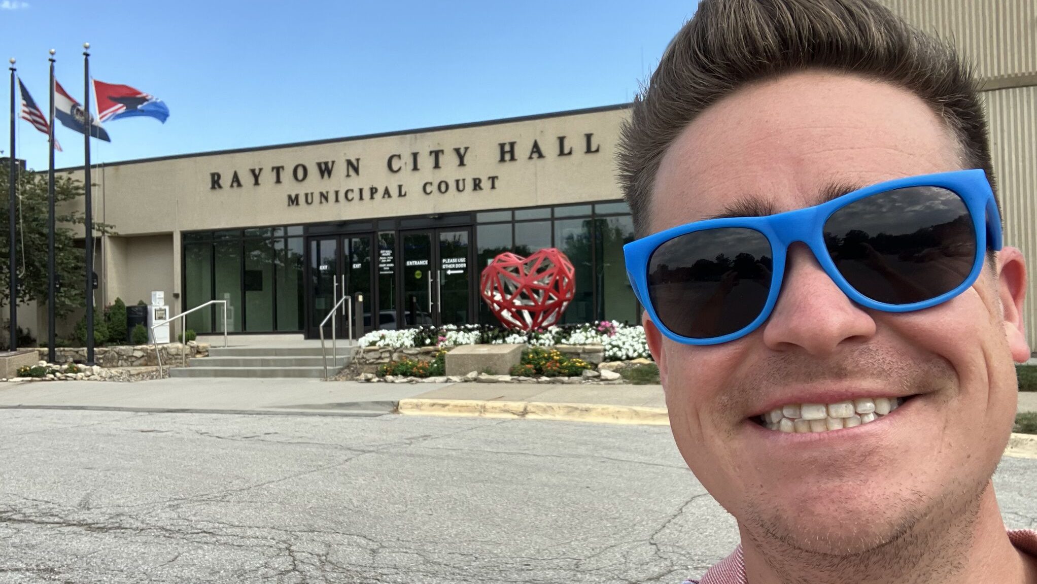
After the passage of the ordinance, I ordered flags to hang in our Council Chambers and to fly in front of City Hall. Personally, I ordered stickers of the flag and passed them out to coworkers, friends, and family. On July 17, as part of our Spirit Week to celebrate the incorporation of Raytown, we held a flag-raising ceremony, where the redesign flew for the first time. It was special sharing my design with others and seeing something I crafted flying from a flagpole next to the Missouri and U.S. flags. I leaned in and included it in my City Hall Selfie this year. Once the design was publicized in printed and digital media, and the physical flag was flown, the city pursued a service mark with the Secretary of State.
This process is something I might never have imagined going through even five years ago. Yet, working on this for a year or two has been so rewarding and I’d recommend it to anyone that’s ever considered it.