This post is part of a partnership between ELGL and State of Place, who uses extensive knowledge of urban design and empirical analysis to quantify what people love about places and forecast why it makes sense to make them better. Check back weekly for a post from this partnership.
Designing for the most vulnerable in mind…this is the first concept Michelle Woodhouse (COO) learned when she became a State of Place Trained Rater. Recently she came across an opinion article that highlights what would happen if cities were designed by moms, so we outlined a few of the highlights from that piece to bring to life the State of Place data geekdom and illustrate why inclusive design matters and how data-driven citymaking can help make that a reality!
“Mommy, I need to go potty!” As a mom, panic ensues when one of my kiddos (5 and 2 years old) announces they need to go to the restroom when we are out and about. Recently, this happened when we were on a walk in our neighborhood – we literally call going for a walk “going on an adventure” because I never know what to expect. The dirt road in front of our house does not have a sidewalk (yeah, don’t get me started), so we have to walk in the middle of the bumpy, muddy road. When a car approaches, we all run to the edge and wave to ensure that the driver sees us. I feel like I’m herding cats with the girls pushing their toy strollers over an unpaved road and me frantically looking all around us until we arrive safely at the newly paved sidewalk (finally!) on the street perpendicular to ours. Of course, as soon as we make our way to “safety,” one of my daughters announces she needs to go potty (despite the fact I asked them numerous times if they needed to go before we left – ah, mom life!). This is the moment when I really wish we had a port-a-potty on the passive “park” at the corner – not to mention benches and playground equipment!
This experience brings home just how much work my neighborhood needs to do to meet the needs of my family, especially given the fact we have young children. We are among the most vulnerable of pedestrians walking around our neighborhood. And yet, ironically, the suburbs are supposed to be where you move to when you have a family because they are “better for kids…” I shudder to think of all the schlepping around I will be doing once both my daughters are school age and involved in a flurry of after school activities because they simply cannot get there on foot – but I digress (and note topic for a future blog post!).
All of this and more is why I recently had a “YES! This!” moment when reading Christine Murray’s opinion piece in The Guardian – “What would cities look like if they were designed by mothers?” She brilliantly calls out the lack of diversity in the architecture and urban planning fields that has led to poorly designed cities, especially for our most vulnerable of users.
Principles of Mommy-Friendability
To illustrate Murray’s points in our “signature data-driven” style, I pulled out a few of the design principles she discussed and linked them to some of the urban design features State of Place measures. In fact, this type of objective “diagnosis” (we call it the State of Place Profile, which breaks up the State of Place Index into ten key urban design principles that are empirically tied to walkability) can help citymakers understand a block or neighborhood’s current assets and needs so that they can begin to highlight areas of improvement, again, especially for our most vulnerable users (in fact, we think it should be the first thing any city planner does! ;))
SOMEWHERE TO SIT! (SINCE SITABLE CITIES ARE THE NEW WALKABLE CITIES)
State of Place measures a number of sidewalk amenities (see # 28 in the Irvine Minnesota Inventory – IMI- off of which State of Place is based, which lists all of our 290+ measures). Specifically, we measure the presence and volume of benches or chairs; bus stops with seating; and ledges for sitting. Additionally, State of Place also measures a number of gathering places that provide seating, including outdoor dining.
SOMEWHERE TO PLAY!
State of Place measures the presence of, quality of, and access to a variety of public spaces (see #14a on the IMI again) such as parks, playgrounds, playing or sport fields, plazas, squares, courtyards, public gardens, beaches and others.
SOMEWHERE TO…GO POTTY!
State of Place notes whether there are visible public restrooms clearly open to the public (see #29). This is important not just from a mom’s perspective, but from an equity perspective too – yet this is often overlooked in nearly all residential neighborhoods and even in most mixed-use neighborhoods.
The Place Devil is in the Details
When it comes to holistic, inclusive, and equitable urban design, it’s often the little things that matter most (which is why State of Place is so obsessed with “micro-scale” data – I mean, there’s like almost 300 features we measure, so yeah, call us nit-picky!). While my kids and I were out on our “adventure,” our experience would have been much more pleasurable and safer if we could have easily had more places to sit, play – and heck, even one place to go “potty” would have been welcome (I have enough grey hairs already because of these two!).
In addition to pointing out the design principles that matter to moms, Murray explains that “lived experience is a great teacher.” Indeed, during my pre-State of Place life working at the Design Council, I was actively involved in projects that focused on designing for our ageing population and I became passionate about inclusive design. If you are a designer and don’t have the “lived experience” you must to what it takes to “walk in their shoes.” In fact, before merging with the Design Council, the Commission for Architecture and Built Environment (CABE) published “The Principles of Inclusive Design” that shares methods to remove barriers and enable people to participate equally, confidently and independently in everyday activities. Inclusive design places people at the heart of the design process and celebrates diversity! Understanding insights and needs from the end user is critical (and fortunately for you citymakers, we took great pains to do that when designing the IMI that underlies State of Place, including conducting a number of focus groups with a diverse set of built environment users, from students, to older adults, to folks of various races and ethnicities).
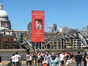
Finally, Murray ends with a wonderful example of mommy-friendly urban design we should all aspire to, which happens to be one of my favorite places in London – the Millenium Bridge. It connects St. Paul’s Cathedral and the Tate Modern over the Thames River. I visited this awesome place as a “tourist” with my kids this summer and loved its inclusive design! Murray called it “the uninterrupted ramp that floats you over the Thames” – yup – NO steps. And there are a variety of public spaces with places to sit, eat, play (and yes, go potty!).
Bottom line, when you design for the most vulnerable of us in mind, you design an awesome place that people (everybody) loves! We’ll follow this up with our own State of Place analysis of this mom-approved place to see how well it objectively stands up to Murray’s principles! In fact, we’ll be doing a lot more State of Place analyses on the places we – and you – love OR love to hate.


