This post is part of a partnership between ELGL and State of Place, who uses extensive knowledge of urban design and empirical analysis to quantify what people love about places and forecast why it makes sense to make them better. Check back weekly for a post from this partnership.
Last week, we kicked off the first installment in our Vision Zero blog series, Design for our Lives, in which we argued that urban design is and can be a matter of life and death (in fact, sadly, 1 in 100 of us might end up on the death side of that equation in the US). The personal story of loss I shared that could have easily been prevented by a coat of paint – applied to create a midblock crossing – has clearly resonated with many of you. Accordingly, this series will continue to include personal stories along side the “facts” to present a more robust, compelling narrative about the power of place and why urban design needs to be more fully incorporated into the Vision Zero movement. So today, we revisit my home state, Florida, where I’ve been visiting for the past 12 days…and what it was like to reimmerse myself into my carless teenage years in Miami.
OH OSLO, YOU HAD ME AT TRAMS…
I can’t quite describe the shell shock of landing into MIA from the Nordics…Overwhelming heat and humidity aside, these two places could not be more polar (sorry, couldn’t resist!) opposite. Arriving in Oslo is a blissfully easy and pleasant experience, from catching one of many trains heading into the center of town straight from the airport, to boarding a tram from the central train station to my stop, steps from the apartment I called home for two months. Worst part was lugging my bags up two flights of stairs.
THERE’S NO PLACE LIKE HOME?
Contrast that with a ridiculously long walk on MIA’s “people” mover (i.e., moving walkways) that pretend to fit two people side by side – so one can walk on the left and the other stand on the right – but really don’t, so you end up stuck behind people who for whatever reason are perfectly happy standing while a revolving beltway moves them at what has got to be like 1mph OR you attempt to bypass them on the side of the moving walkway, only to realize someone has brilliantly rolled out carpet that makes it nearly impossible to wheel your luggage. Gosh, I’m exhausted and I haven’t even left the airport. Next, you take an actual people mover (I guess you can call it an elevated tram line, maybe?) to the Miami Intermodal Center, which includes the car rental center – because there’s just no other way to get around Miami. I settle into a compact car (after the rental agency, which I won’t name, nearly forced me into a pick-up truck or a minivan! I was like, yeah, you might not want to rent one of those to someone who hasn’t owned a car in 11 years) and brave the highway. Multiple mistaken turns off the freeway and countless landscapes of strip malls later, I arrive at my cousin’s house, an hour before my mother’s birthday dinner reservation (which we of course have to get back into the car to get to). Good news though, no lugging bags!
LOOKING FOR WALKS IN ALL THE WRONG PLACES
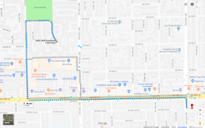
But the most striking difference between Oslo and Miami is decidedly not the discrepant “user experiences” of each city’s airport to town “transportation system” – it’s the widely different experiences at street level that make a movement like Vision Zero that much more important in the States than Scandinavia, where it originated. You see, apparently, the frustrating airport to Cuban-mother-birthday-dinner transfer was not enough of a re-entry shock. For some reason, I decided that I needed to “reacquaint” myself with my “Miami story” of how terrifying it is to cross the street. So I decided to walk from where I was staying to a CVS about 7 blocks away (no biggie, right?), as I had to get a few things there anyway.

IT’S THE DENSITY, STUPID
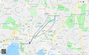
Well, it turns out that 7 blocks in Miami equates to 1.4 miles, which is a blip on the radar that is the Westchester neighborhood where I grew up. Contrast that to Oslo, where I lived 1 mile – roughly 20 blocks and two neighborhoods – away from the Katapult Accelerator program (e.g., my coworking space). This, my friends – commonly known as building density – is one of the most fundamental reasons why my Miami walk is both incredibly tedious and inefficient, and why nobody (except the other two “brave” souls I encountered on my way) does it. Compactness is not only a critical ingredient for convenient walking, it’s a crucial part of indeed getting to vision zero that often is not considered or focused on…\
THE DEVIL IS IN THE (URBAN DESIGN) DETAILS
NOT MY KIND OF TIGHTROPE
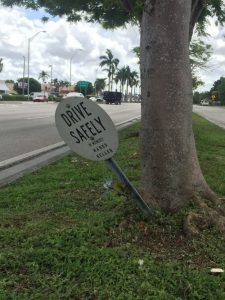
Now, speaking of road widths, most of my walk, unfortunately, was along what amounts to a 6-lane, and at some points seven lane, highway, with cars whipping by you at 40mph – IF they are actually obeying the speed limit. It was not uncommon to feel a different kind of wind at your step at points where some 2 ton vehicle decided it was OK to go 50mph. I can honestly say, I was petrified pretty much the entire walk. I literally felt I was putting my life on the line, just to bring you guys this blog (I mean, I love my readers but I was beyond terrified). The sidewalks really were pencil-thin, and without any buffers whatsoever, I felt like at any point, some distracted driver could “accidentally” swerve right into me. I don’t know about you but a few inches of curb height doesn’t really do it for me, safety wise. And let’s not forget about the sitting targets waiting at the bus stops, inches from the curb. Come on Miami, we can – and must – do better!
PLAYING A REAL LIFE GAME OF FROGGER
And then there was crossing the street. I decided it would be safer to cross the street as soon as I could, as there happened to be a “feeder” road on the south side of the street, which would allow me to walk alongside a slower residential two-way street – plus the CVS was on the north side anyway. Of course, I was required to activate the pedestrian signal and wait my turn to receive 20 seconds to cross a seven lane stretch of road. I’m a frequent, New York City style walker and I barely made it across in time, especially since I purposely waited a second or two to make sure I made eye contact with the car in the right hand turning lane, lest they ignore the almost laughable “no turn on red when pedestrians in the crosswalk” signal. I would have videotaped this, but I was honestly too terrified to.
YOU CALL THIS DESIGN?
Ok, now onto safer pastures…the feeder road. It was here where I came across the only two other pedestrians I encountered on my walk – round trip included. They clearly were seeking shelter from the behemoth that is Bird Road (the 6-7 lane road) as well (and interestingly were both carrying bags – no one does this walk for pleasure!). But don’t get me wrong, while I definitely felt more safe on this side road, it was not more convenient. I came across several barriers along the sidewalk, including overgrown bushes and cars parked way to close to the edge of the sidewalk. But I think the funniest – but actually, saddest – “design feature” I came across was this curbcut – I guess there was a two for one special on drainage ditches and curbcuts? Not to mention the fact that they are placed in the most ridiculous place – why do we have to go all around the curve just to cross? Seriously, Miami. But at least one of the blocks had it on both sides…the next intersection…apparently someone decided this is where the sidewalk ends for our disabled or mobility limited friends.
As I got closer to my destination (yes, this is long, but no where near as long and torturous as it felt actually walking this stretch of road), I started to notice something very curious, that my cousin had mentioned to me previously. Every single bus stop had a few bicycles parked next to it – dockless bikeshares to be exact. I found this to be so interesting, and asked a young boy waiting for the bus if he had ridden there, but he had not…So I’m conjecturing here, but people are likely taking the bikes to the bus stops to avoid the inconveniences I have been pointing out – I mean, the inconveniences are the same, but at least you get through them faster! I’ll have to leave this particular novelty to another blog post, but I thought this phenomenon was something some of you would be quite fascinated by…
TALKING ‘BOUT MY DESTINATION?
So, I finally got to CVS, after crossing a slightly less ominous 4-lane road, and finding the pedestrian access point – to the the CVS parking lot – about 150 ft from the intersection. It would have been better, clearly, had it been diagonal to the intersection, but they’d be designing for like the three people intrepid enough to walk here – or more realistically, the people who have no other choice but to walk there (and this is truly where the biggest problem lies with this disastrous street design). Done with my errands, and mostly cooled off, I thought I was done with the worst of it, until I realized I basically had to redo that entire walk to get back. Uber anyone? And that return trip was when I really did fear for my life.
COMEDIC RELIEF?
IT’S NOT ABOUT ZERO SUM…
Ok, by now, I’m dripping in sweat – and not just because it was 90 degrees outside. I got back to my cousin’s house and while I’m not religious, thanked God that I had survived the walk (and I’m not exaggerating – on a drive later that day, I saw an accident where clearly the car – or at least the cars entire front bumper and frame – had been propelled onto the sidewalk along that same stretch of road). This is beyond undignified (I didn’t even bother getting into how ugly and boring the walk was because of other poor urban design features). This is pretty much criminal. Or at least should be. Dying on this road as a pedestrian – it’s a real possibility. And yet the only ones that are typically blamed are the driver – and yes, often even the pedestrian. But the missing bad actor in all of this – it’s the public sector. They designed this road this way. They prioritized the vehicle, at the expense of the pedestrian and bicyclist. But this doesn’t have to be a zero-sum game – and that’s really the message that’s at the heart of Vision Zero.
OF COURSE IT’S NORDIC!
Vision Zero is a campaign to “eliminate all traffic fatalities and severe injuries, while increasing safe, healthy, equitable mobility for all.” As our infographic mentioned, having originated in Sweden in 1997 when Vision Zero was passed by Parliament, the fundamental philosophy behind the law was to adopt a more collectivist approach to collision prevention. Rather than placing the full blame for casualties on the driver or pedestrian – where they distracted? On the phone? Taking risks? – Vision Zero advocates for a shared responsibility for street safety. Accepting human nature and our tendency to make mistakes, the Swedes looked at how to redesign the transportation system to account for reality.
CHANGING THE RULES OF THE GAME
Today, the Vision Zero movement has expanded internationally, growing support over the past two decades among pedestrian advocates, urban planners, health experts, and politicians alike. It’s centered around two key principles:
- Rather than accept that human error – and thus traffic injuries – are inevitable (i.e., see traffic collisions as “accidents”), the Vision Zero movement accepts this and seeks to improve traffic policy and roadway designs to help eliminate or reduce the severity of injuries; and
- They adopt a transdisciplinary approach to address the complexities of roadway design and traffic collisions. Accordingly, drawing inspiration from industries such aviation and nuclear power,
Vision Zero asserts that all traffic injuries are preventable, and that road system designers must consider user error in creating the system: both road users and designers share responsibility for its safety. Currently, there are 34 cities in the U.S. that have adopted Vision Zero and most are working to eliminate traffic deaths through data-informed policies.
But how well is Vision Zero actually working? What policies and design measures – besides simply reducing speed limits – are being implemented? Are these changes made ad-hoc? Are they part of an overall strategy? What’s the decision-making process behind identifying and prioritizing these changes? Is the effectiveness of these interventions being measured and how are success metrics defined when you’re talking about life and thankfully relatively few deaths (at least on an intersection basis). Which cities have been most “successful” at achieving Vision Zero goals? How is design truly being considered in the Vision Zero equation? So many questions – which is why we’ll pick this up in the next installment.
AGAIN, URBAN DESIGN IS ABOUT LIFE AND DEATH
 In the meantime, we’ll leave you with yet another reason why we must get the answers to these questions right (if last week’s blog and my Miami misadventure didn’t convince you enough) as soon as possible. So it turns out that the same day I went on my sojourn in Miami, at exactly the same time, a young mother and her 2 year old had ventured out for a stroll, this time just a few blocks away from where I’m staying now, in Tampa.


