Today’s Morning Buzz is written by Jenny Kosek, Communications Strategist for the City of West Allis, WI. Connect with her on LinkedIn and Twitter.
- What I’m Reading: Anton Chekov’s “Uncle Vanya” (I’m not that lofty, but I am going to be in the play this fall)
- What I’m Listening To: The Record Company, “All of This Life”
- What I’m Watching: Exhibit A on Netflix
________________
Although I was a resident, when I applied to join the City of West Allis in 2016, I hadn’t spent much time on my city’s website. I had gone to it when we first moved to find out where to vote, and I visited one specific URL four times a year to pay our water bill. But with a background in website copywriting and CMS management, I took a new look at the site when I applied.
It was…well, here’s what I saw in October 2016:
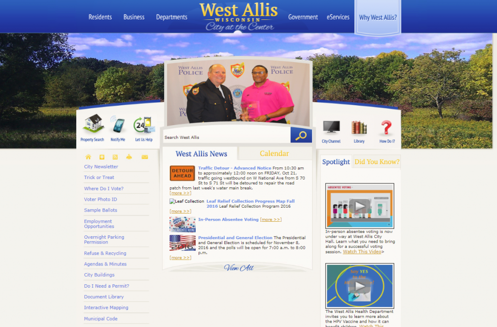
FYI, that left column menu went down for days.
The site had been built in 2012 and was a mix of static design, inconsistent formatting, and what seemed like ten million PDFs standing in for pages – in addition to about twenty million pages of actual content.
It wasn’t mobile responsive, and city departments formed the main navigation, which made it nearly impossible for a resident who had no idea what different departments did (like me) to find the information they needed.
But change was coming. When I interviewed, it was explained that a complete city rebranding and new city website were in the works over the next few years, and the position I was interviewing for would play a key role in both projects.
More than two and a half years later, the brand has been developed and rolled out with a comprehensive three-year marketing strategy behind it, and the new website went live early this year.
Both the rebranding and the site redesign were tremendous undertakings with a lot of moving parts and strong opinions, but ultimately, it was data that allowed us to create a website that served our residents and met 21st century site design best practices.
Because so many stakeholders had such strong feelings about how the organization’s website should look and function, our redesign team wanted to build a solid base of data to justify the decisions we made as we crafted the new site.
To do this, we started with a public survey, asking our residents to tell us how they used our existing site and what they liked (or didn’t) about it. We learned that most of our visitors came to the site infrequently, maybe once a month or less, primarily for city news and event information.
Accordingly, it made sense for us to put this content front and center in our navigation and on our homepage.
We asked residents what information they wished was on the city’s site that wasn’t at that time. We discovered that many of the topics respondents requested did exist on our website, but were impossible to find. We needed to find a way to put a wide range of topics front and center and make it easy for site visitors to quickly find what they needed.
Additionally and overwhelmingly, respondents asked for a community calendar of events – which existed on the old site, but wasn’t user friendly. We knew we wanted to highlight a well-functioning calendar right on the homepage.
Next we looked at our website analytics using Google Analytics and the analytics module built into our old site. We wanted to know what search terms users were most commonly using on the site, and found some big discrepancies between our language and our users’ language.
For instance, we found that the term “refuse” had been searched for less than a dozen times in the prior year, while “trash” or “garbage” had each been searched hundreds of times. Yet all of our website content on the subject used the term “refuse.”
The same with our “municipal yard” vs. our users’ “city dump.” This told us we needed to do heavy rewriting of our content to make it user-focused, written for users to both find in our search tool and consume easily. For the amount of PDFs we had, we also had a very low download rate, suggesting users weren’t finding content they needed or didn’t know what to do once they found it.
We also found that our most-visited pages were our parking permit/request overnight parking pages followed by our library’s pages and trash/recycling information, and our least visited pages were those relating to individual departmental services, and elected officials and legislative information.
We also received a report from our redesign consultant listing the countless issues that made our old website not compliant with ADA guidelines, including improper formatting of links to PDFs, lack of alt text on most images, and not spelling out the hundreds of acronyms throughout our site.
This report left us chagrined, but provided much-needed clarity and set standards on formatting text, links, and images, which were all very inconsistent on the old site.
Our consultant also informed us that our old site read at a grade 19 level – simply meaning, you needed a doctorate to understand our website.
With 50% of U.S. adults unable to read a book written at an eight-grade level, there was no way our users could make heads or tails of our content even if they could find it.
Finally, we reviewed our Five Year Strategic Plan. This plan emphasized creating a “Virtual City Hall” that made it easy for residents to get information and communicate with city staff, so we wanted to make sure the new site highlighted services as well.
Our plan also emphasized “Brand/Image/Destination,” so featuring amenities and events for visitors became a priority. Development and redevelopment are also key to our Strategic Plan, so we wanted to put all of our business information prominently on the homepage for potential businesses to find.
And we knew from our public website survey and a prior community events survey that our residents are very interested in event news and updates, so we decided to make that a key link in our main navigation.
Data made all the difference as we crafted our new site. Using our resident survey and guided by our Strategic Plan, we organized a new navigation, cutting down our main menu options from six to four. We implemented AP Style formatting and ADA best practices in our page layouts to lend consistency and compliance to our content.
We spent months reworking PDFs into webpages and converting PDF forms to HTML. We ran our new copy through grammar and language tools to ensure we were writing at a 9th grade level or lower. We moved our city calendar to a prominent spot on the homepage.
We continued digging through our keyword search analytics to make sure we were using the words our residents used for our services. We created a “How Do I…” section at the top of our homepage that put those many in-demand topics in an easy-to-sort tool.
And we applied our new brand. All of these efforts helped boost our SEO and make it easier for the correct search results to come up in browser searches and our own website search, to ensure our new site would be easier for users to connect and engage with.
Our new site launched early this year, and data once again tells the story: Site visits are up 45% over the same period in 2018. We decreased the number of downloadable PDFs we had available, yet downloads increased by 382% because users can now easily find the documents they need.
Our online resident help tool, which we call Let Us Help, existed on the old site but saw a 100% increase in page visits on the new site because we changed the way users navigate to it. Best of all, visitors are coming back but navigating faster – repeat site visits have increased 8%, while actions per visit have decreased by 3%.
This is how you approach an effective website redesign: from the data up. Don’t get bogged down by what photos or fonts to use or if you can add videos or slideshows. Understand your users and how they use your site, and craft your content for them.
Put yourself in their shoes and remember that most citizens don’t care what department does what – they just want to solve their problems. You can help them do exactly that when they visit your site if you rely on data to craft it.
Supplemental Reading
Podcast: Law in Plain English with Jenny Kosek & Dan Bolin
Four Lessons from Rebranding West Allis
I Have to Ask: Show Don’t Tell