This post is brought to you by Greg Stopka, Strategy and Innovation Manager at the Park District of Oak Park, as part of ELGL’s “Creative Community” learning series about the role of arts and culture in local government. Sign up to guest blog about your local government experiences with creative placemaking here – tell your story so we can learn from you!
What’s your favorite movie? Whether it’s a comedy or drama, a great movie has one thing in common: a strong narrative. There is a protagonist, a challenge that needs to be overcome, actions taken by the protagonist to overcome the challenge, and an outcome (hopefully a happy one). For example, in the Avengers (spoiler warning), the protagonists are Iron Man, Black Widow, Captain America, Thor, Hulk, and Hawkeye. They have to stop an invasion from Loki and his minions. While at first, they try to do this individually, they eventually realize they need to work together to defeat the bad guys. Their efforts result in New York saved and a well-deserved take-out.
What about your least favorite movie? Why didn’t you like it? One of the reasons may be it had a poor dialogue. Were the stakeholders underdeveloped? Was the problem that needed to be overcome unclear? All of these reasons could result in a poor story.
What does this have to do with data? I’d argue that you can use the same storyboards Marvel uses to design an engaging and powerful story around your data. By leveraging your story, you can better connect with the community and improve the agency.
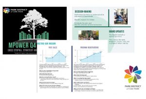
At the Park District of Oak Park, we have a robust dashboard system with key performance indicators (KIPS) around our strategic plan initiatives (Meeting our Mission, Community and Customer Focused, Financially Strong, Maintaining and Improving Infrastructure, Organizational Excellence, and Staff Excellence). Each quarter, our management team would meet to review all the Dashboards and identify what positive and negative data trends they

see and any actions we should take to improve. We then shared a data report update to the Board.
What were the results of these meetings?
What was the problem? While we had access to a large amount of data, it was difficult to make decisions; meetings were boring; no follow-through; and those who talked…talked a lot. If your data discussions are putting your staff to sleep, then it’s likely boring your community as well.
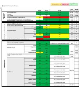
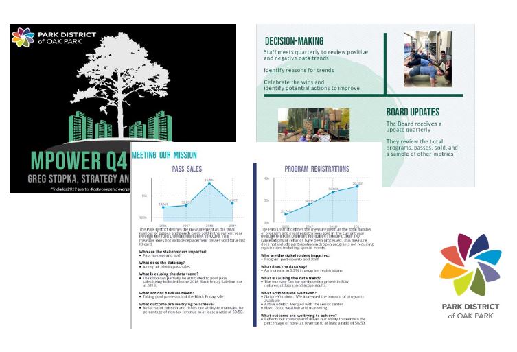
For the Board, they received a quarterly report that looked something like on the left. Data without visuals leads to a lack of engagement and data without a narrative leads to a lack of an explanation.
So how did we improve? We made two changes to provide less data and more story:
1) Redesign the quarterly management meetings to focus on identifying the story behind the data and what actions we can take to improve.
2) Share the story identified in these meetings with the community.
How did we do this? First, we broke down famous movies into storyboards. Think about our Avengers example from the beginning. What does that look like in a storyboard?
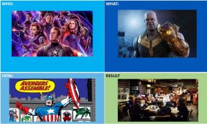
In my storyboard, I used the entire Avengers franchise, you get the picture.
After reviewing movie storyboards, we asked staff to do the same thing with our dashboards. Who are the stakeholders behind our data, what do the data say, what challenges did we have to overcome (what still exists), what actions have we taken in the past (what can we take in the future), what outcomes are we trying to achieve. We grouped them into cross-department teams and provide them with a blank storyboard. They’re asked to review the data and fill in the blanks. We also ask them to prioritize what challenge(s) are the most important and circle what actions have had the biggest impact. In this example, staff analyzed why we were behind in pass sales. The results looked like the following:
Stakeholders: Pass users, staff
Data Trend: 2019 pool passes are down from last year at this time
What challenge did we overcome? Due to a Black Friday pool pass sale in 2018, 2019 pool passes counted in the previous year.
What actions have we taken? We held an additional pool pass sale in the spring prior to pool season.
What actions can we take for the future? Remove pool pass sales from Black Friday to ensure we have consistency in the data.
What result are we trying to achieve? Pool passes sold to meet our mission
After reviewing the data, we use a program called Picktochart to create infographic presentations to tell the story staff identified. An example of these can be seen on the right.
Stories are a powerful mechanism for connecting citizens to the work of local governments. By sharing a strong narrative in addition to data, communities can engage the public in the work they’re doing to promote transparency and build trust.